>>25398
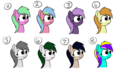
I made this little draw to explain my thoughts. I'm also learning so take what I say with a grain of salt. I've found that working with patterns in your color wheel (color schemes) makes things much easier. What's more important though is to stick to your color schemes. Each pony might work fine on their own in pic related, but together they're a disaster because their pallets clash too much.
>1
I used complementary colors (opposite side of the wheel) with a light value and a medium saturation to them here. The show typically follows this pattern for background ponies. To add to that they use a lot of secondary colors. I'd suggest this if you're looking for a pony that doesn't stand out too much.
>2
I used a triadic color scheme here. It's useful if you want to give a background character a bit more importance. If you want a solid mane color, then I recommend giving them an accessory for you third color.
>3
This is more of a main character design. I used purple to give a sinister aura to her. To emphasize this I kept the hue the same.
>4
This is similar to 3, except I used analogous color scheme. The yellow brings out a very positive aura to her.
>5
This is monochromatic. I typically don't use this, but it can be handy if you want to quickly fill in some background ponies. It's used a lot in anime. If you want to you can add a colored layer on top with a low opacity for example blue. This will give the impression that the background characters are sad, hopeless, or whatever your chosen color signifies. If you don't want to go full monochromatic an alternative is to just lower the saturation of your characters.
>6 & 7
Over here I used white and black, but you might notice that they aren't pure white and black. The colors are a bit easier on the eyes that way. You can also match up the hue of the white and black using the color schemes discussed already. In both cases I use a complementary color scheme. White (which has a pink hue) goes with green, and black (which has a blue hue) goes with orange. You may also notice that I moved the saturation and value such that the mane is the reverse of the coat. Once again I'm working with patterns.
>8
I had a bit of fun here to show you some things to avoid. Saturated colors, too many hues, and an undefined color scheme can give you a pony who's seen better days.
Some final thoughts I'd like to give is that these rules aren't concrete, but they are a good starting point when designing a pony. Best of luck drawfren. (\^c^/)